


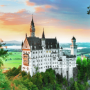


The True Size Of Europe

When you are from a European country, it is difficult to grasp how big countries like Australia, Brazil or the US are (like, really, really big). Well, this also goes the other way around! When you are from a country that is as big as Brazil, where you can drive for 12 hours and never leave the state you are in, it is strange to cross multiple country borders in one trip, let alone in a few hours. This becomes clear when you compare the true size of your home country to the countries in Europe.
Shannen Beemsterboer
Content specialist @Interrail
The true size of countries
We are not telling you anything new if we are saying that Europe is not extremely big. But how big (or small) is it exactly? Compare your country of residence with (a country in) Europe using The True Size website. Go for it!
So, have you compared the size of your home country to other countries? If you have, you might have noticed that the countries you drag over the map change size when you move them up or down. This is because the map that we generally use is not correct. What!? Yep, the map you might have on your bedroom wall is technically not a correct representation of our little blue planet. And we will explain to you why.
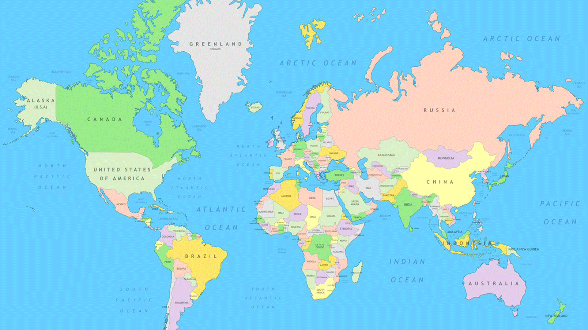
The Mercator Projection
The map we are talking about is the Mercator Projection, the map that is used by Google and for pretty much everything else (if you have a map at home it is most likely a Mercator Projection). Gerardus Mercator, a Flemish cartographer, created this map in 1569 and it was used by navigators on ships. This specific map made it very easy for ships to sail in the same compass direction all the time, without having to change its course during the trip.
Basically what he did was make a representation of our globe on a flat surface. However, this visualisation is very distorted: countries that are further away from the equator look larger than they are. They had to be stretched out to keep everything in the right place.
Greenland and Russia
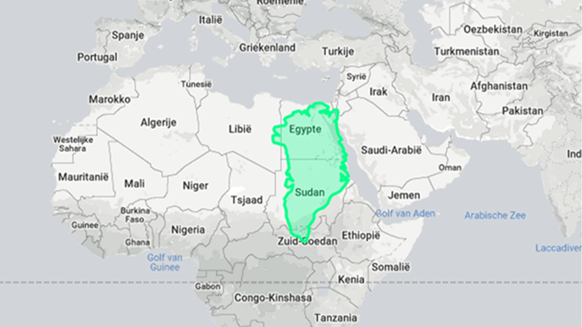
Whenever you look at a map, 2 of the biggest land masses you will see are Greenland and Russia. But, based on the explanation we gave you above, they are not nearly as big as they are shown on the map. For example, on the map Greenland has approximately the size of the continent of Africa. But in reality, it is only the size of the 2 African countries of Egypt and Sudan together!
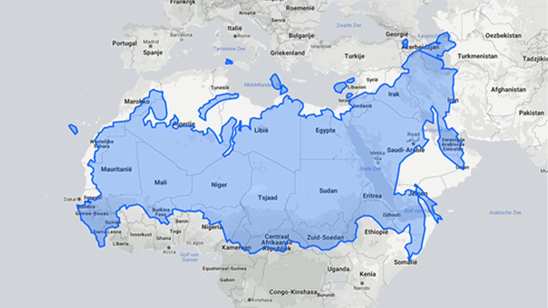
The same goes for Russia. On the map it looks like a massive piece of land, which it is, but it is much smaller than you think. It looks like it could fit the continent of Africa at least twice, but in reality it is only as big as Northern Africa and part of the Middle East. It is basically half the size! Crazy, right?
And now visualised
This concept is quite difficult to explain, so in case you are more of a visual thinker, check out this video for a visual explanation of the Mercator Projection and the true size of countries: Which countries surprised you the most?
You might like this as well:
-
![Scenic-view-window-moving-train]() 7 types of Pass benefits you'll love Want the ultimate train ticket to explore Europe? Interrail is so much more than a flexible rail pass; it's also packed with tons of freebies and discounts.
7 types of Pass benefits you'll love Want the ultimate train ticket to explore Europe? Interrail is so much more than a flexible rail pass; it's also packed with tons of freebies and discounts. -
![first- class-train-masthead]() Benefits of 1st Class Train Travel in Europe Want to know if paying more for first-class train travel in Europe is worth it? Here are some benefits of travelling by rail with a 1st class Global Pass.
Benefits of 1st Class Train Travel in Europe Want to know if paying more for first-class train travel in Europe is worth it? Here are some benefits of travelling by rail with a 1st class Global Pass.
Change of currency
You cannot change the currency once you have a Pass in your cart. Remove the Pass, and then change the currency on the website header.